When I tell people that I make interpretive signs for a living, the most common response I get is ‘I’ve always wondered where those come from.’ It’s definitely become clear to me through many conversations with clients that people have a hard time conceptualizing the work that goes into making them, especially panels that are illustrated.
Most panels are created by a team of people, each with their own specialty. Interpretive writers compose the text copy, while an illustrator creates the images. All of it gets sewn together by a graphic designer that puts the final layout together. Whether it’s done by many people or a few, these are the basic steps and most designers do them in that order. However, I want to make the argument to flip that on its head.
I’m lucky in my business as an interpretive designer to have the skills to do all the steps of panel creation (aside from printing and installation) by myself. I’ve been doing it for nine years now and I’m a big proponent of leaving the text for last. Let me explain why by walking you through the process I took to create one of my more complex panels.
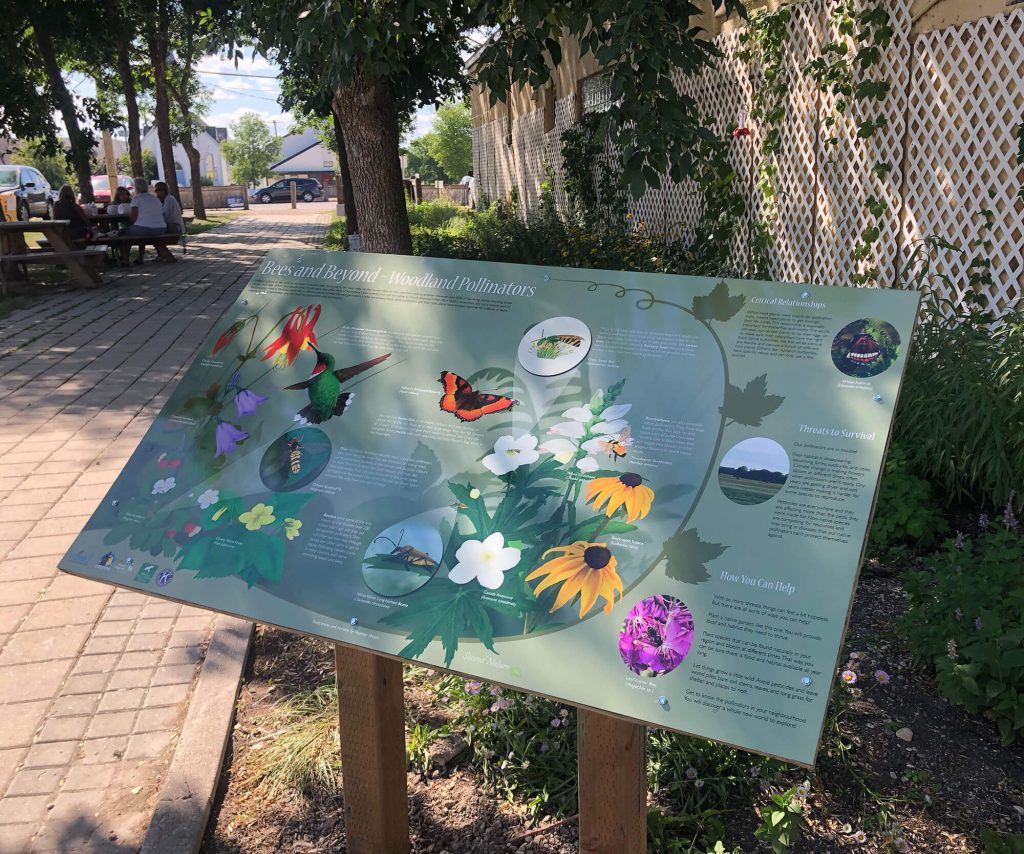
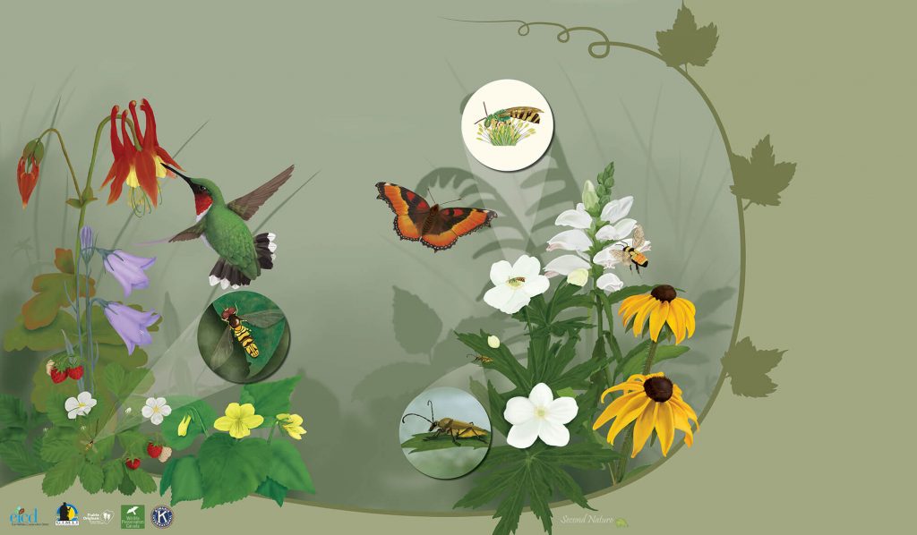
I’m not saying there should be no text at the beginning, just no copy for the panel. The whole thing should, however, start with a plan. You want to be sure you have a clear idea of the message you’re trying to get across. What do you want people to take away from your exhibit? (Interpretive planning is a whole other subject unto itself). In this case, it was a single sign. We wanted people to understand the relationship between the plants in the garden this panel was being made for and the pollinators that rely on them. We also wanted to give people tangible things they could do to help pollinators in their own world.
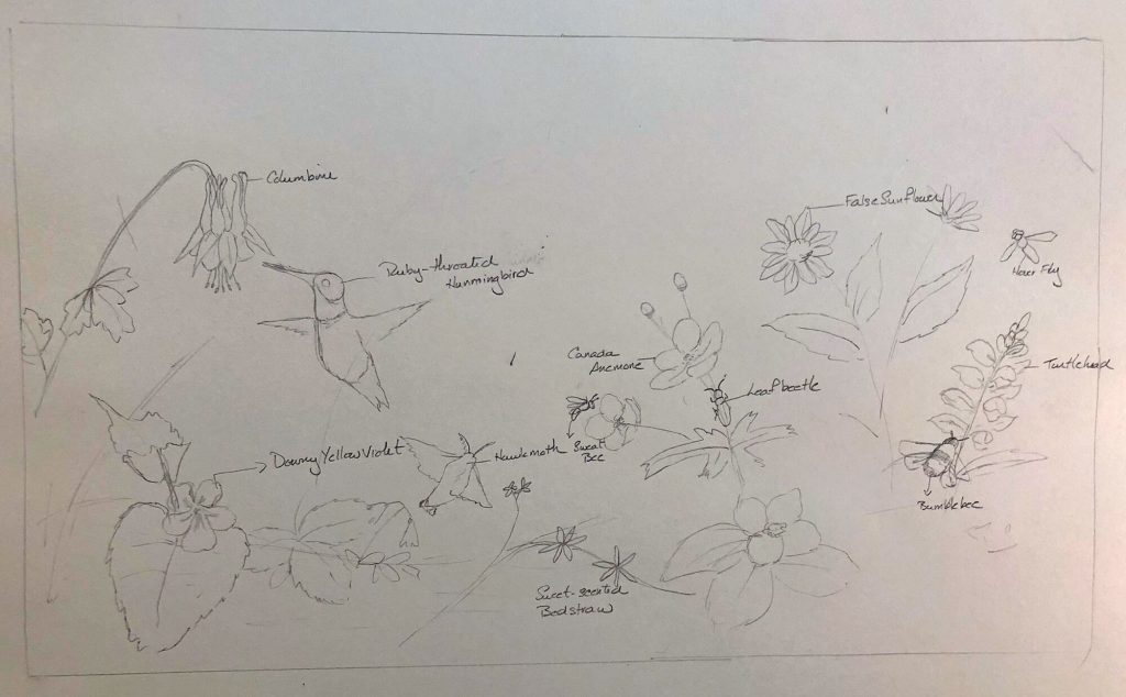
With that in mind, I got sketching. The client and I talked out what looks we liked and how the goals we wanted to achieve could be addressed visually. This is a very important step. Before any text is written, I draw a framework that outlines the images we wanted in the panel and how they and text could be laid out in the confines of the shape we had to work with. This sketch then becomes my reference for the rest of the process. It helps me plan the illustrations: their subjects and orientation, right down to making sure all the shading goes in the right direction. It ensures the final panel will be cohesive.
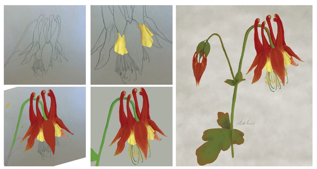
Once the outline is approved, I get painting. I paint digitally, which gives me a lot of flexibility and makes it easier for me to stitch everything together with the freedom of moving things around if I have to.
My illustrations start on paper. I have an ever-growing photo reference library, but will sometimes have to approach other photographers to ask permission to use one of their images as a reference. When you’re doing highly-detailed illustrations, it’s important to use several different references for the same subject. Once I get the basic drawing down on paper, I bring it into my computer, usually by taking a photo of it with my phone. Then, it goes into Photoshop and the painting begins. I could write a whole other post on my Photoshop painting process, but suffice it to say, it involves many layers and a lot of patience. I paint all the pieces, including the background as separate files.
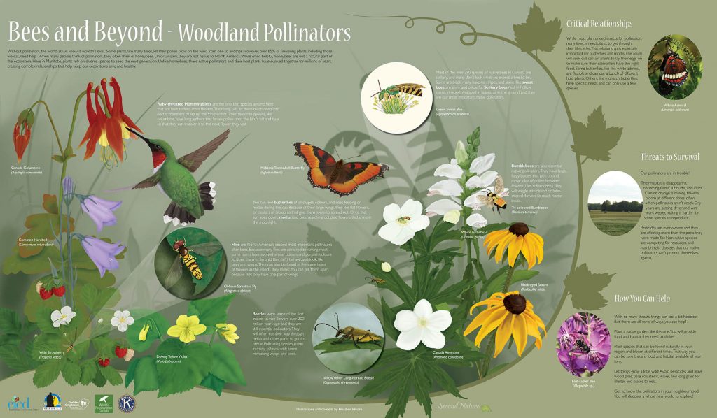
As I finish more elements, I start thinking again about the big picture. I try colours and fonts (checking in with the client) and create the final layout file in InDesign so that I can start moving pieces around. No matter how detailed your original outline sketch is (mine aren’t very detailed), you might have to make some adjustments so that everything will fit and not look cluttered. This is the point that I make sure that I have enough space for the text. Even though I haven’t written it yet, I know from the outline what I need to talk about, so I can plan accordingly.
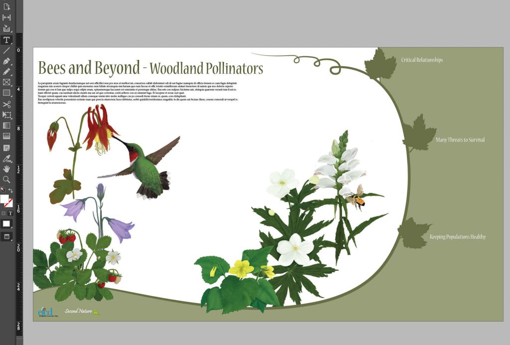
Once I have all of the pieces finished, I start layering them into the final image. I identify any gaps I have to fill and ensure I have room for all of the text. It can help at this point to put in headings so you know what you’re talking about where.
Now that everything is where I want it to be, I finally start writing the text. I know some of you reading this will find it counter-intuitive, but by doing it this way, I never end up with too much copy. I can only fill the space that I have created. It’s kind of like trying to get your point across in a tweet. It usually takes many iterations before I get the message clear and free of errors. By doing things in this order, I make sure that your focus is on the visual elements of the panel and the text is short, sweet and impactful.
While I’ve described this process in the context of interpretive panels, I feel you can apply it to any type of visual scicomm you’re doing, whether it’s a poster or a powerpoint, people find good images compelling and easy to digest and by crafting your interpretation with the eye to images first, I think you can create a more effective piece, whether it’s being created by one person or a team.